Book designer spotlight: Evi O
Evi O spent a decade working as a designer at Penguin Books Australia, where she specialised in illustrated books on food, design, art, architecture and gardens, before opening her own studio in 2017. She spoke to Books+Publishing for our ‘book designer spotlight’ series.
How did you get into book design and where have you worked?
I got my first freelance publishing job illustrating dinkuses for Penguin Books Australia. I was 21, and that was 2008. At that time they were also advertising for a position and I went for it. Eight and a half years later, I’ve experienced designing different book genres, witnessed a global merger of two publishing giants and probably know a little bit too much about the industry, ha. Following my time at Penguin Random House Australia, I freelanced before starting my own design studio at the end of 2017. It’s 2019 now and there are four of us in the studio, catering for publishers in Australia and overseas, and also working with a variety of businesses on their branding and digital projects. It’s never a boring day in the studio.
Which of your book designs are you most proud of—and why?
It’s very hard to say, as each project has its own merit. But here are a few, and why:
JapanEasy and Tokyo Stories, published by Hardie Grant UK. Two books from the same author, Tim Anderson, who lets his designer run wild with imagination. You can tell they’re the love children of all involved when you see the books. In a saturated market of Japanese cookbooks, I think they both have merit in standing out. JapanEasy manages to reflect the refined beauty of Japanese cooking through a bowl of golden ramen and a chopstick. You don’t need to read the title to know it’s a Japanese cookbook, nor do you need photography, and we all felt the minimal illustration managed to bring out the feel of what’s inside. Tokyo Stories applies the same theory, but this time we went all out and attempted to bring Tokyo in one fine graphic, which I think we managed to do, with the help of flour inks and bold use of foils.
T2 the Book, published by Penguin Australia. It was a blank canvas when we started and I think we produced a beautiful package. It pushes the definition of a book designer, as I worked closely with the T2 team to create and strategise content. That was real fun.
Tokyo Local (and the Local series) from Smith Street Books also has a special place in my heart.
Zodiac series, published by Hardie Grant UK. A series of 12 books that were fully illustrated and designed by my team at Evi O. Studio. Coming out later this year. Watch out, they’ll change your life!
The Planthunter, published by Thames & Hudson Australia. The content is important and it was such a privilege to be a part of.
The new volume of Iconic: Modern Australian Houses by Karen McCartney, published by Murdoch Books. A re-release of two very successful volumes that highlights the golden era of Australian modern architecture. It’s always a special collaboration with Karen McCartney. She knows her stuff and the end product is always pleasure to a designer’s eye.
The Mini Monographs series, published by Thames & Hudson Australia. A series that shines a light on the excellent Australian female artists. Not to mention we blind-debossed the title. No printing, that was a first in my whole career. Beautiful objects.
I can go on, but I will stop.
What’s your favourite book cover from the past few years? Why do you think this cover works so well?
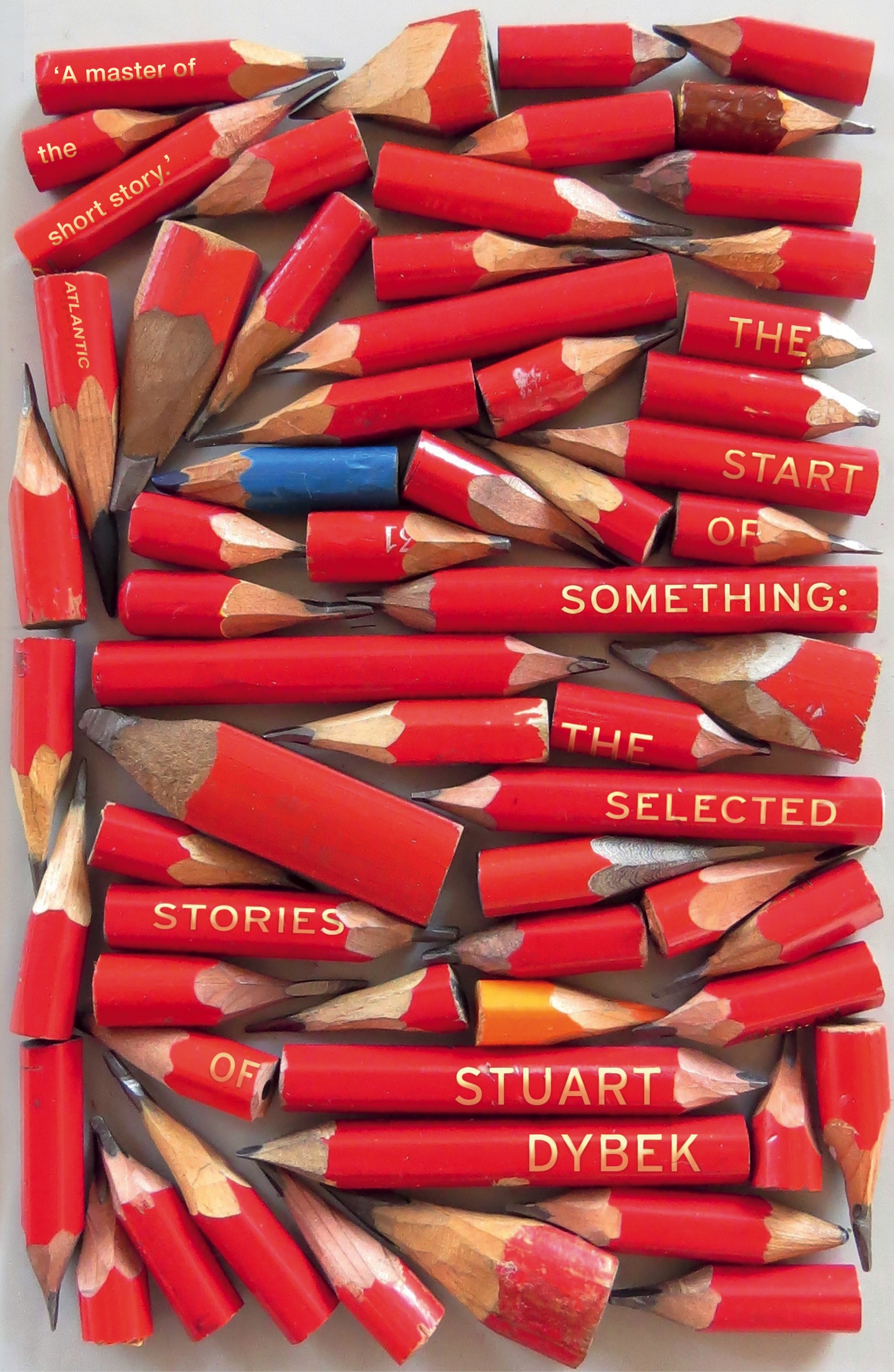
If I may choose two, it would be The Start of Something: The Selected Stories of Stuart Dybek (Vintage) and The Largesse of the Sea Maiden (Denis Johnson, Vintage), both designed by the genius Suzanne Dean. Both are very striking, and I think started a new book cover genre for the time. Read: you see a lot of new briefs coming in wanting ‘that look’.


Which book design elements do you think are currently being overused? And what would you like to see more of?
Overused is a hard one to say, perhaps aesthetic is more the word? There is, of course, a tendency to follow a certain trend. Remember when every cookbook on the shelves featured calligraphic type? Though I feel like book designers are more experimental than ever these days as you have to please both the bookshelves and the tiny Amazon tile. I probably would like to see how far we can push the physicality of a book form. I think in art publications this aspect is constantly explored, not so much in trade.
Is there such a thing as an Australian book design aesthetic?
Yes, there is definitely such a thing. What it is, I invite you to go to a local bookshop and find out yourself. We can play ‘where’s the Australian cover game’. Winner gets chicken dinner.
Category: Features


