


Book designer spotlight: Ngaio Parr
Independent designer and illustrator Ngaio Parr has worked with publishers including Penguin, Thames & Hudson, Hachette, Hardie Grant and Pantera Press. ‘I’m a little different to most book designers in Australia as I’ve never worked in-house at a publisher,’ she says. She spoke to Books+Publishing for our ‘book designer spotlight’ series.
How did you get into book design and where have you worked?
I studied design a little older (I already had a fine arts degree) and saved up to do an exchange at RISD [Rhode Island School of Design]. I studied book design there and was mentored by Doug Scott, who perhaps recognised the spark of joy that we shared when discussing those fine details of publication design!
I’m a little different to most book designers in Australia as I’ve never worked in-house at a publisher! I originally worked as a publication designer at the Institute of Modern Art, and for the past seven years I’ve worked as an independent designer, with clients like Penguin, Thames & Hudson, Hachette, Hardie Grant and Pantera Press. It can be difficult getting a foot in the door in this industry if you haven’t worked in-house, it’s been a slow burn and I appreciate when publishers break through their current roster of designers to work with me.
Which of your book designs are you most proud of—and why?
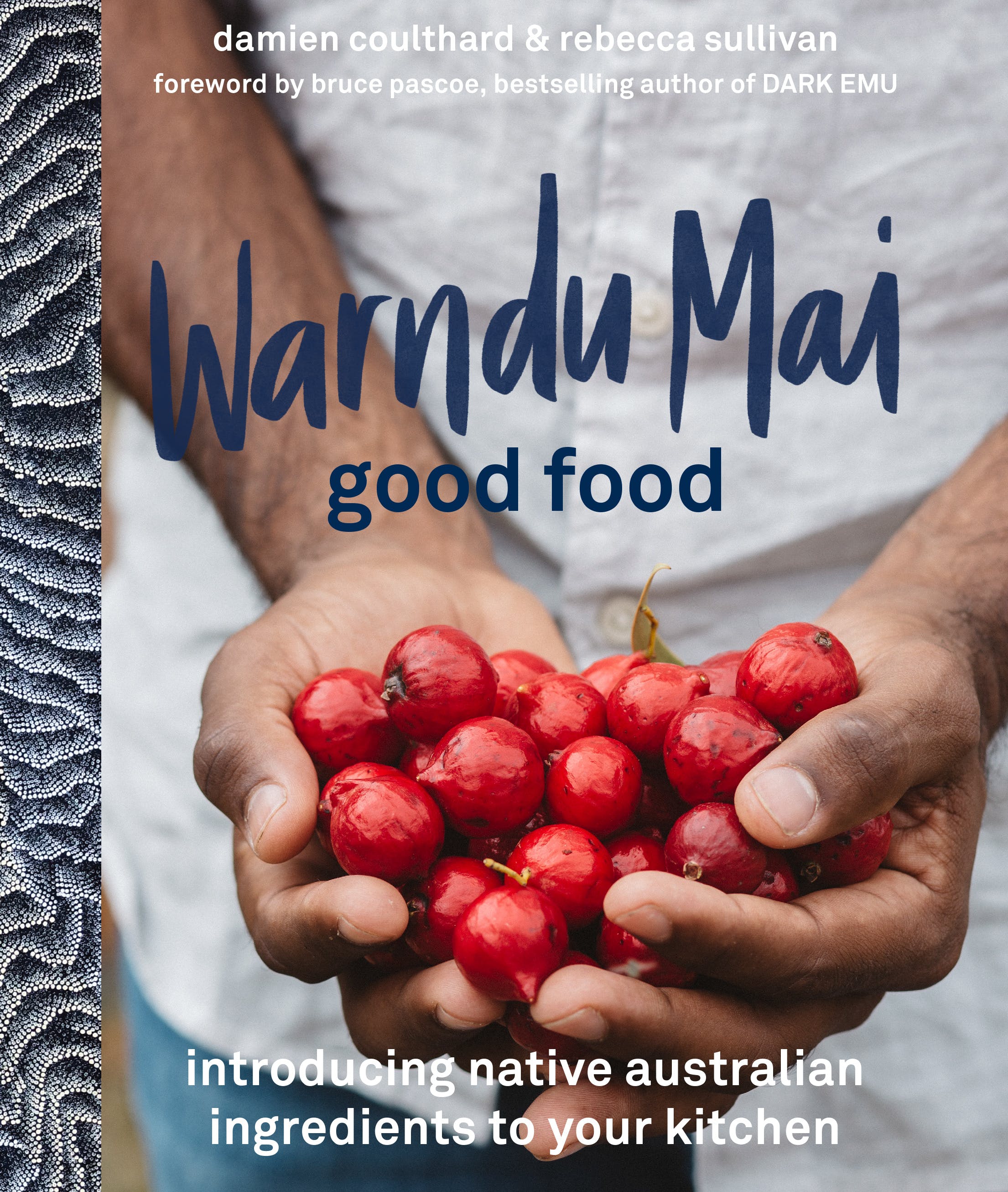
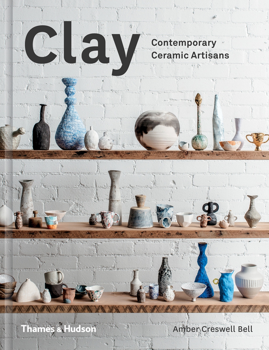
I’m proud of all of the books I’ve worked on! At the moment though, I’m proud to have designed Warndu Mai (Damien Coulthard & Rebecca Sullivan, Hachette), a cookbook featuring accessible recipes using native Australian ingredients. It is important to learn about sustainable food sources, and has so much value culturally, socially and environmentally. I’m also proud of Clay (Amber Creswell Bell, Thames & Hudson), the first mainstream publication I designed—it’s so lovely to see the book continuing to be loved by the creative community all over the world.
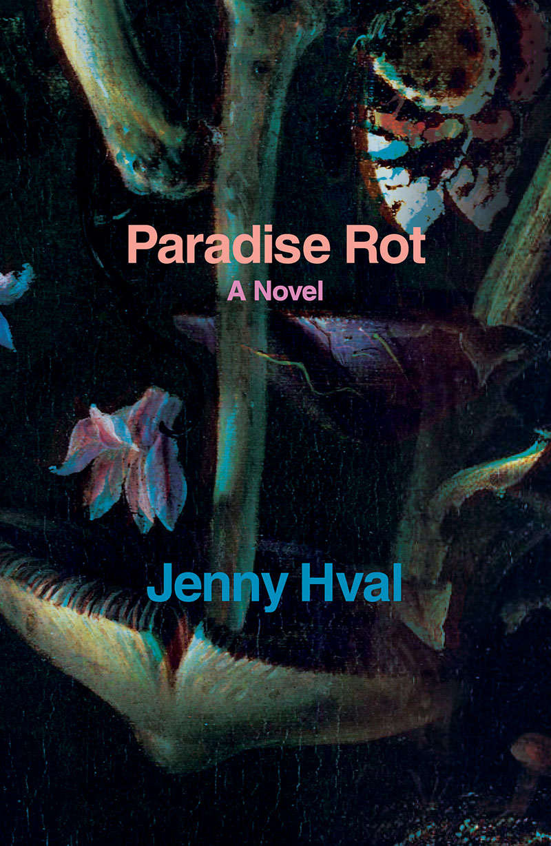
What’s your favourite book cover from the past few years? Why do you think this cover works so well?
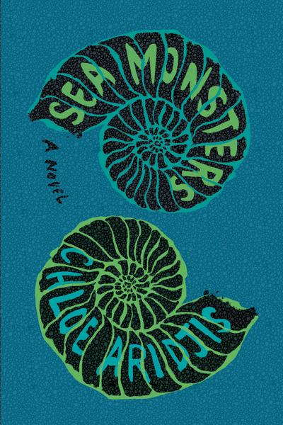
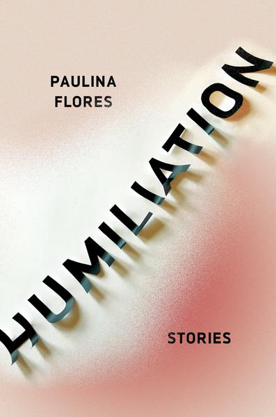
I have so many! A few that stand out are the cover of Sea Monsters (Chloe Aridjis, Catapult), designed by Strick & Williams, Humiliation (Paulina Flores, Catapult), designed by Nicole Caputo and Paradise Rot (Jenny Hval, Verso), designed by Chloe Scheffe. They all create intrigue, pull you in and put a little twist on the concept of the book.
Which book design elements do you think are currently being overused? And what would you like to see more of?
I know why it’s wanted in the Instagram age, but bigger and bolder titles sometimes don’t fit the context of the book’s narrative. I love seeing something unexpected—quiet, texture, concept—they often provide such joy to the publishing industry once they get through all the hoops required to green light them!
Is there such a thing as an Australian book design aesthetic?
Just by the nature of the industry being relatively small here in Australia, an aesthetic does form. But I’m hopeful that the more intertwined the industry becomes globally, the more we can create a big, mixed-up, diverse, vibrant, global aesthetic.
Tags: book designer spotlight
Category: Features